Helping brands thrive through intuitive identity building and experience-driven digital design. Anastasiia Kuklenko is a multidisciplinary designer focused on digital experiences and visual identity, creating solutions that blend clarity, function, and refined aesthetics.
Massa Confusa
,
Visual identity
,
2024
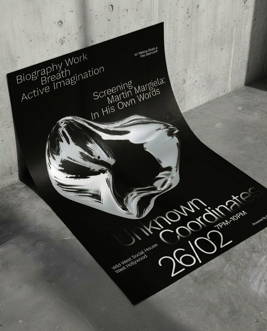
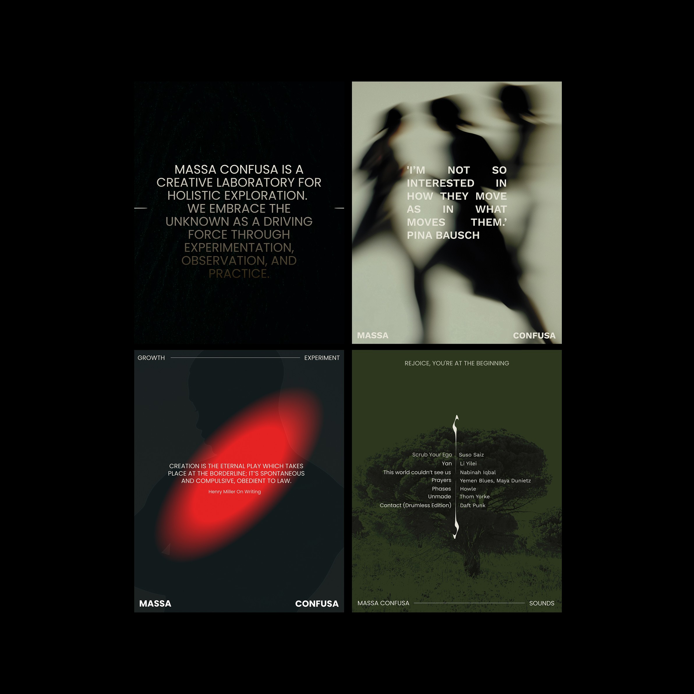
Designed a visual identity and content system for Massa Confusa, a Los Angeles–based creative laboratory exploring the subtle art of transformation. The identity frames creative chaos as a catalyst for exploration, evolving into an experimental visual language that balances tension and harmony across all digital expressions.
MC_01.JPG

MC_02.JPG

MC_03.JPG

MC_04.JPG

MC_05.JPG
MC_06.JPG
Massa Confusa
,
Visual identity
,
2024
Designed a visual identity and content system for Massa Confusa, a Los Angeles–based creative laboratory exploring the subtle art of transformation. The identity frames creative chaos as a catalyst for exploration, evolving into an experimental visual language that balances tension and harmony across all digital expressions.

MC_01.JPG

MC_02.JPG

MC_03.JPG

MC_04.JPG

MC_05.JPG

MC_06.JPG
Radius
,
Logo System
,
2025
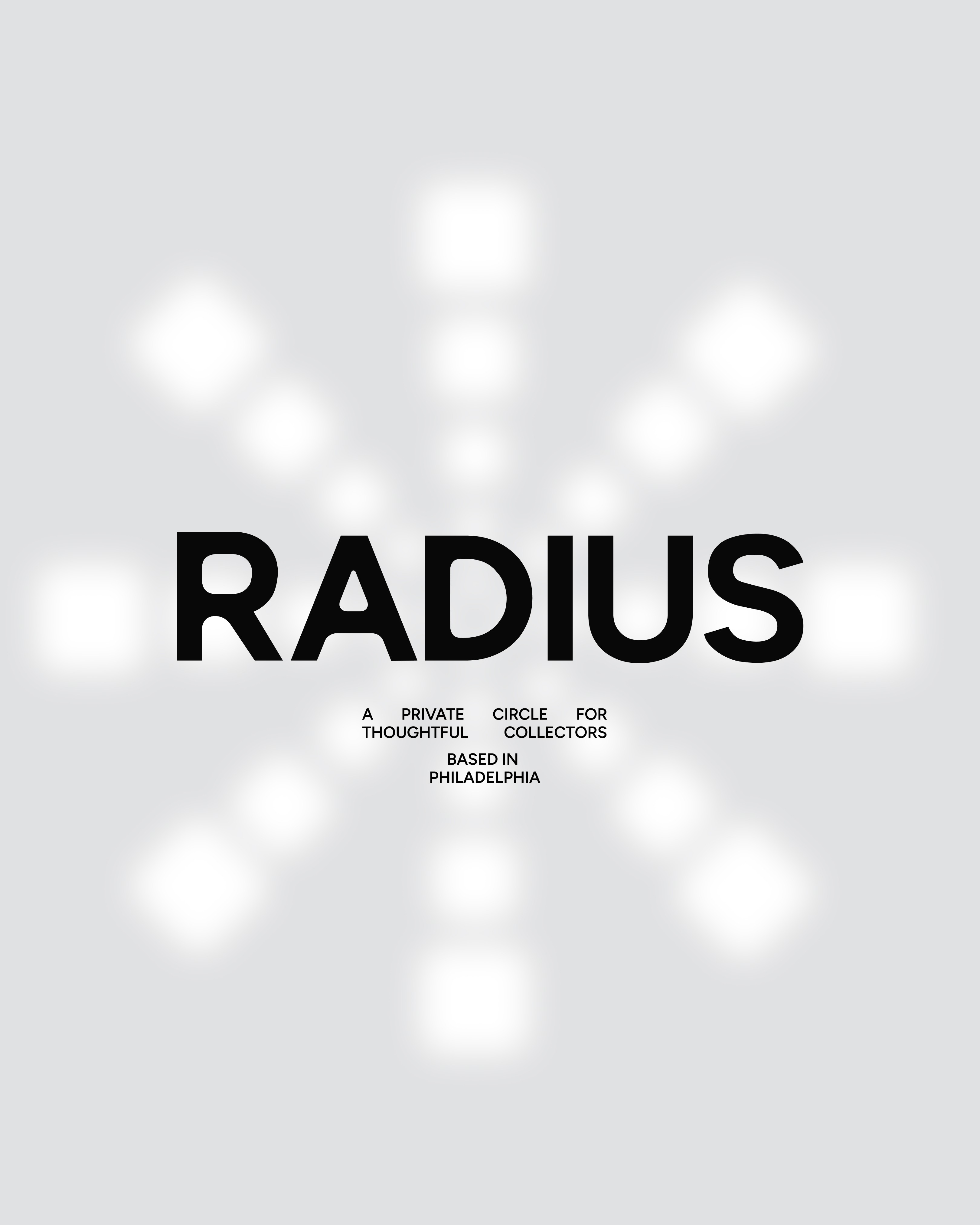
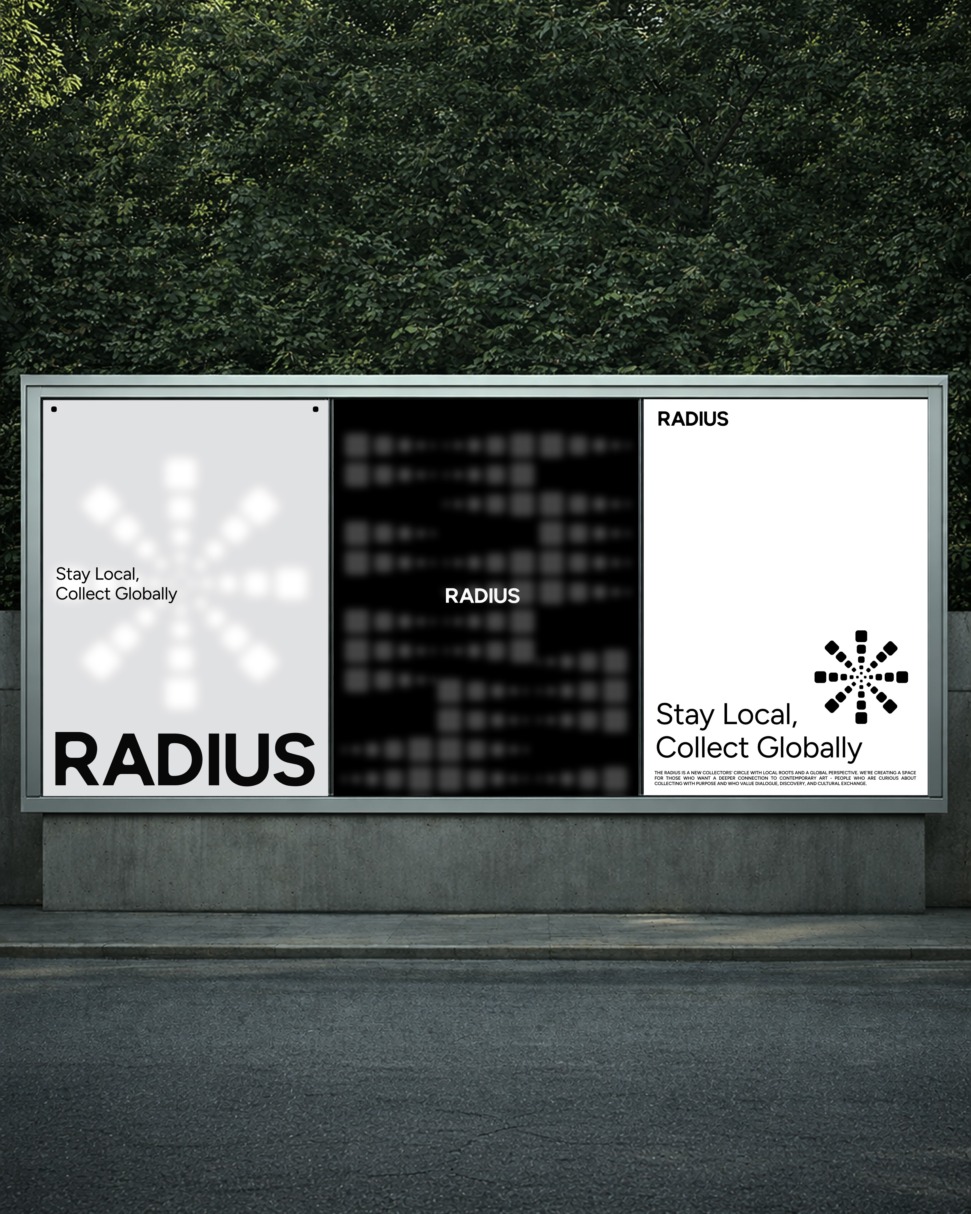
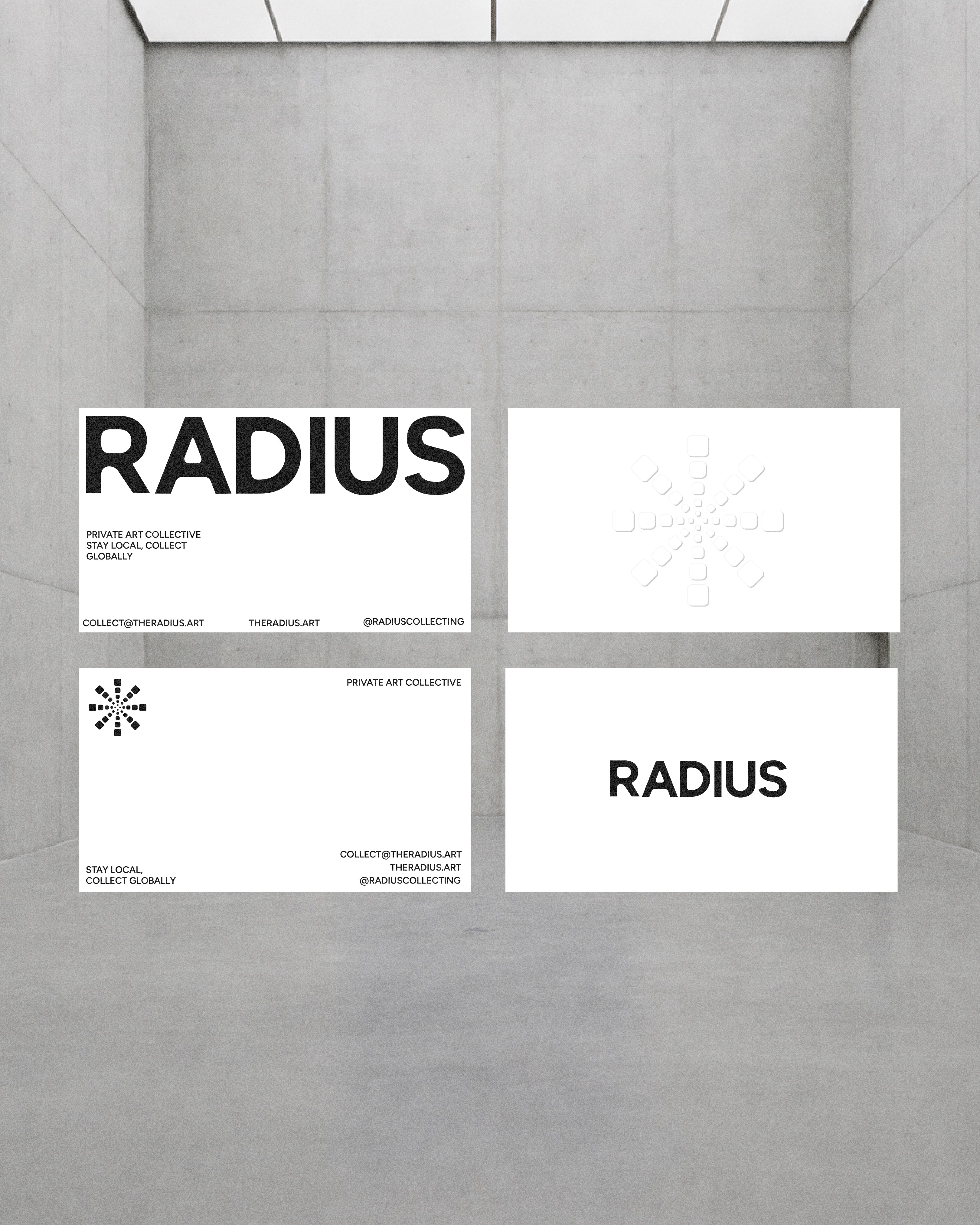
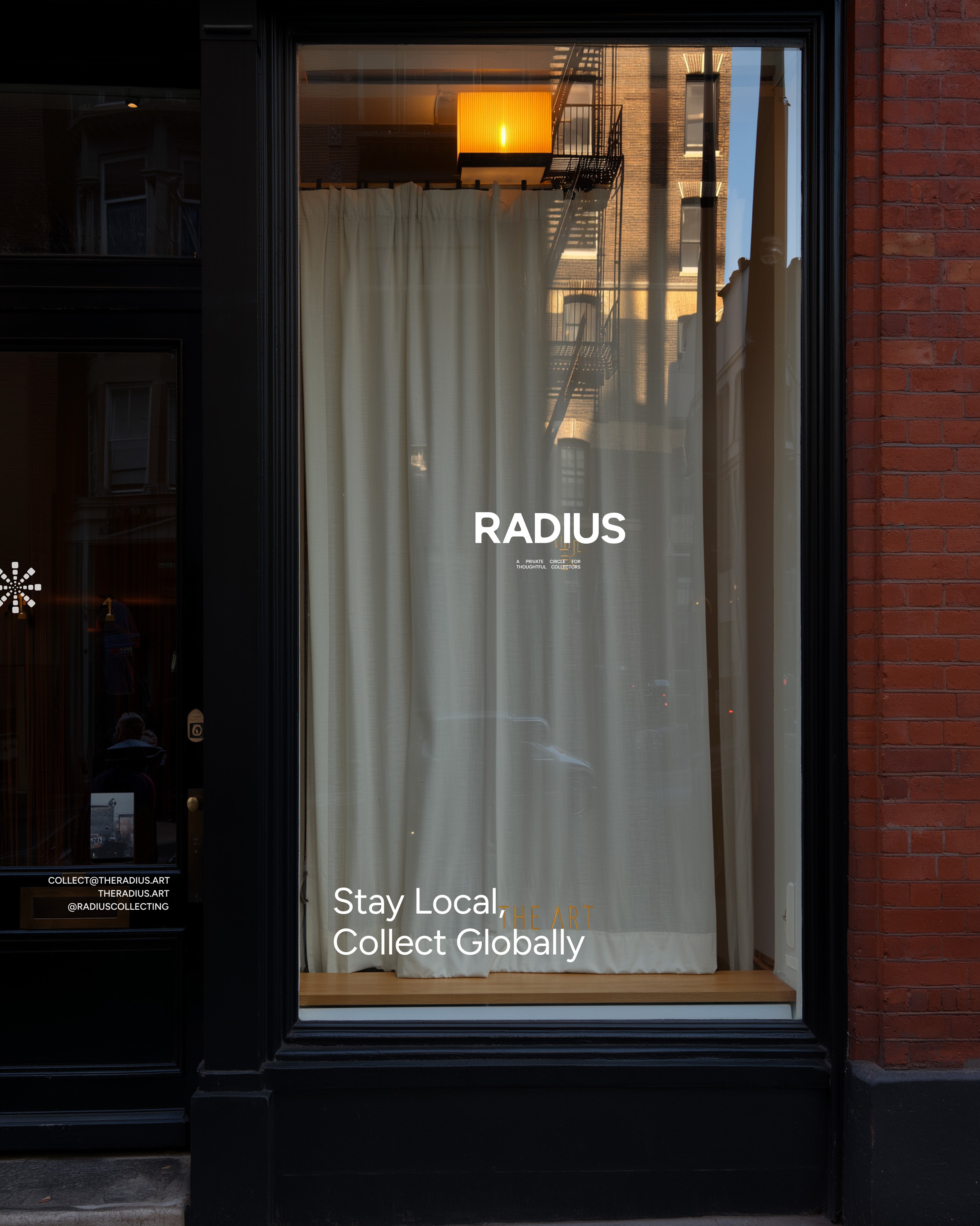
RADIUS is a Philadelphia-based private circle for art collectors built on connection, collection, and global exchange — rooted locally, open globally. The art field is complex and diverse. When presenting multiple voices, the most important thing is space: space for each artist to exist, to breathe, to be seen — like a calm white gallery room where attention naturally settles on the work itself. This became the core concept for the identity: a quiet, neutral system that supports the artists without competing for attention.
rds_01.JPG
rds_02.MP4
rds_03.JPG
rds_04.MP$
rds_05.JPG
Radius
,
Logo System
,
2025
RADIUS is a Philadelphia-based private circle for art collectors built on connection, collection, and global exchange — rooted locally, open globally. The art field is complex and diverse. When presenting multiple voices, the most important thing is space: space for each artist to exist, to breathe, to be seen — like a calm white gallery room where attention naturally settles on the work itself. This became the core concept for the identity: a quiet, neutral system that supports the artists without competing for attention.

rds_01.JPG
rds_02.MP4

rds_03.JPG
rds_04.MP$

rds_05.JPG

Shuto Kitagawa
,
Website
,
2022
In this project, I designed a portfolio website for a photographer with the aim of creating a cinematic yet minimal viewing experience. The focus was on showcasing works through a clean slideshow and a discreet header menu. By prioritizing negative space, the site allowed the imagery to take center stage, while responsive design ensured fluid viewing across desktop and mobile. Red accents were introduced to add depth and evoke a cinematic atmosphere.

SHT_01.jpg

SHT_02.jpg

SHT_03.jpg

SHT_04.JPG

SHT_05.jpg

SHT_06.jpg
Shuto Kitagawa
,
Website
,
2022
In this project, I designed a portfolio website for a photographer with the aim of creating a cinematic yet minimal viewing experience. The focus was on showcasing works through a clean slideshow and a discreet header menu. By prioritizing negative space, the site allowed the imagery to take center stage, while responsive design ensured fluid viewing across desktop and mobile. Red accents were introduced to add depth and evoke a cinematic atmosphere.

SHT_01.jpg

SHT_02.jpg

SHT_03.jpg

SHT_04.JPG

SHT_05.jpg

SHT_06.jpg
Erling
,
Identity, Label design
,
2023
Designed a label system for Erling’s product line, reflecting the brand’s mission to empower individuals to reclaim their time and focus on what matters most. The design emphasizes clarity, functionality, and a clean aesthetic, aligning with Erling’s identity as more than a cleaning company—a lifestyle that supports productivity and wellbeing.

ERL_01.JPG

ERL_02.JPG

ERL_03.JPG

ERL_04.JPG

ERL_05.JPG

ERL_06.JPG
Erling
,
Identity, Label design
,
2023
Designed a label system for Erling’s product line, reflecting the brand’s mission to empower individuals to reclaim their time and focus on what matters most. The design emphasizes clarity, functionality, and a clean aesthetic, aligning with Erling’s identity as more than a cleaning company—a lifestyle that supports productivity and wellbeing.

ERL_01.JPG

ERL_02.JPG

ERL_03.JPG

ERL_04.JPG

ERL_05.JPG

ERL_06.JPG
Punkt
,
Identity, Website
,
2022
A B2B website was designed for Punkt, a modern publishing buro founded in Ukraine in 2014 that began with aesthetic-driven independent travel magazines and has since grown to work worldwide with brands, design stores, and physical spaces to capture their stories on paper. The site clearly communicates the client’s services to future customers while highlighting the unique vision of the owner. It blends clean, elegant details with modern, sharp design choices, combining visual aesthetics and artistic touches to convey expertise while remaining open to experimentation.

PNKT_01.JPG

PNKT_02.JPG

PNKT_03.JPG

PNKT_04.JPG

PNKT_05.JPG

PNKT_06.JPG
Punkt
,
Identity, Website
,
2022
A B2B website was designed for Punkt, a modern publishing buro founded in Ukraine in 2014 that began with aesthetic-driven independent travel magazines and has since grown to work worldwide with brands, design stores, and physical spaces to capture their stories on paper. The site clearly communicates the client’s services to future customers while highlighting the unique vision of the owner. It blends clean, elegant details with modern, sharp design choices, combining visual aesthetics and artistic touches to convey expertise while remaining open to experimentation.

PNKT_01.JPG

PNKT_02.JPG

PNKT_03.JPG

PNKT_04.JPG

PNKT_05.JPG

PNKT_06.JPG
Openmind
,
Identity, Website
,
2022
Developed a visual identity and social content system for Openmind, a digital design agency focused on brand identity and web design for forward-thinking D2C companies. The design reflects Openmind’s modern, strategic, and human-centered approach—combining clarity, structure, and a sense of curiosity that mirrors the agency’s name and mindset.

OM_1.JPG

OM_2.JPG

OM_3.JPG

OM_4.JPG

OM_5.JPG

OM_6.JPG
Openmind
,
Identity, Website
,
2022
Developed a visual identity and social content system for Openmind, a digital design agency focused on brand identity and web design for forward-thinking D2C companies. The design reflects Openmind’s modern, strategic, and human-centered approach—combining clarity, structure, and a sense of curiosity that mirrors the agency’s name and mindset.

OM_1.JPG

OM_2.JPG

OM_3.JPG

OM_4.JPG

OM_5.JPG

OM_6.JPG
Bonanza Coffee
,
Packaging
,
2024/25
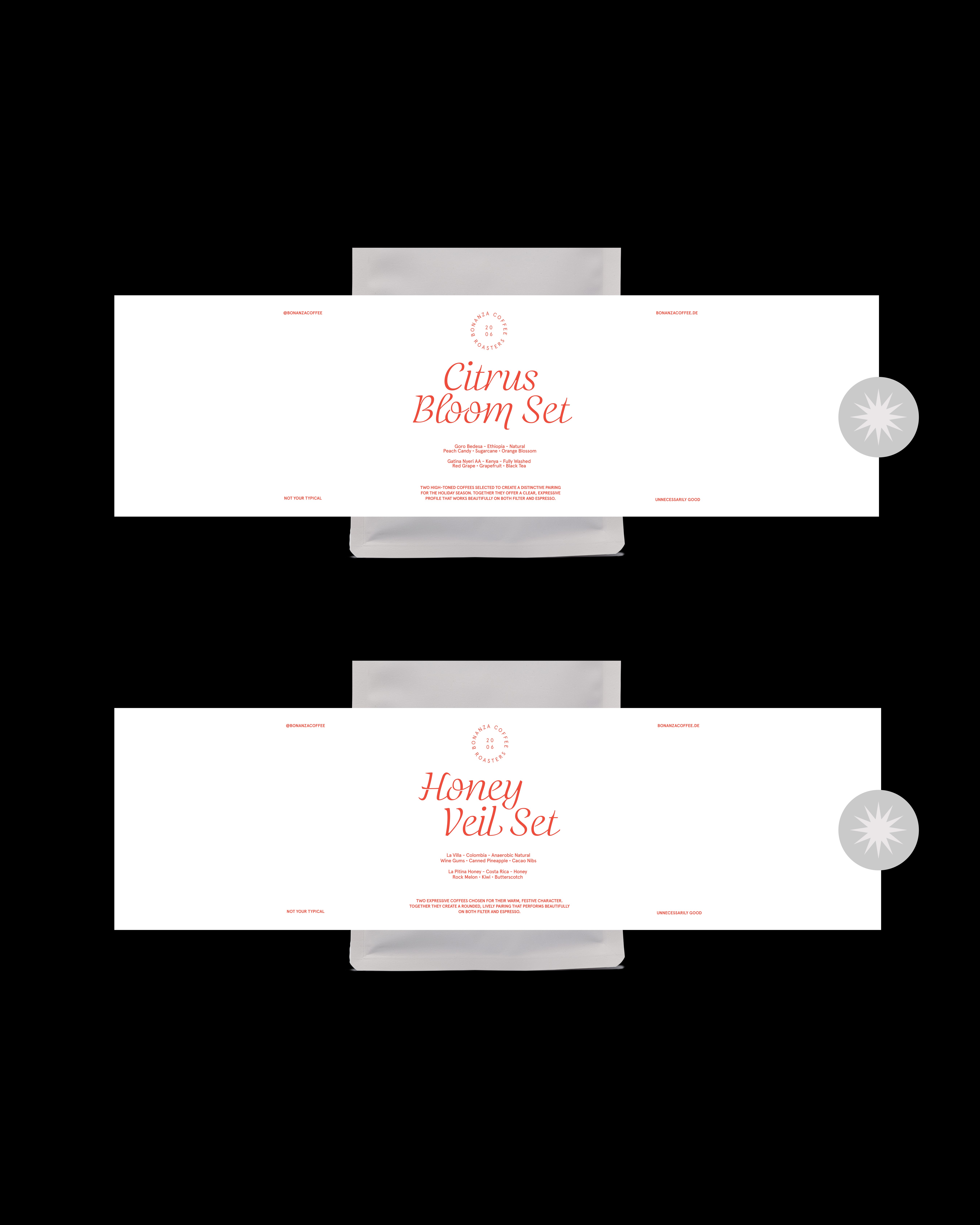
Packaging and visual systems developed to balance function, refinement, and sensory clarity. This includes the packaging solution for the Bonanza ACME Cup—created under tight timelines to be both protective and visually distinctive. For Bonanza’s Cascara Syrup, the label and visual language draw from its Costa Rican origin, translating natural warmth into a minimal, taste-driven expression. The label, visual language, and booklet for Bonanza’s Competition Coffee further the system, blending editorial precision with tactile detail to reflect the rarity and elevated craftsmanship of competition-level coffee. Most recently, the concept and design for Bonanza’s holiday coffee packaging extend this philosophy into a festive edition—pairing expressive flavor profiles with a refined, understated visual language crafted for the season.

BNZ_1.JPG

BNZ_2.JPG

BNZ_3.JPG

BNZ_4.JPG
BNZ_5.JPG

BNZ_7.jpg
Bonanza Coffee
,
Packaging
,
2024/25
Packaging and visual systems developed to balance function, refinement, and sensory clarity. This includes the packaging solution for the Bonanza ACME Cup—created under tight timelines to be both protective and visually distinctive. For Bonanza’s Cascara Syrup, the label and visual language draw from its Costa Rican origin, translating natural warmth into a minimal, taste-driven expression. The label, visual language, and booklet for Bonanza’s Competition Coffee further the system, blending editorial precision with tactile detail to reflect the rarity and elevated craftsmanship of competition-level coffee. Most recently, the concept and design for Bonanza’s holiday coffee packaging extend this philosophy into a festive edition—pairing expressive flavor profiles with a refined, understated visual language crafted for the season.

BNZ_1.JPG

BNZ_2.JPG

BNZ_3.JPG

BNZ_4.JPG

BNZ_5.JPG

BNZ_7.jpg